The purpose of this project required me to identify pain points that users currently experience when they use an online resource for their travel accommodations. Utilizing research methods I learned, I determined that users lacked confidence in reserving their travel accommodations through their mobile device. With delivering a minimum viable product in mind, I designed an app that would allow users to compare airfare between major online resources like Expedia or Kayak with the ability to purchase the fare.
Role: User Experience Designer
Tools: Paper, Pencil, Sketch, Post-It Notes, Key Note, Adobe Illustrator, Omnigraffle
Sprint: 5 days
I began with a feature and user interface analysis between the web versions of Expedia, Kayak, Priceline, and Orbitz to identify any common denominators so I would gain a better understanding of trends. The user interfaces were all very similar with the data input fields such as travel dates and locations as well as navigation bar. The feature that all the websites shared was the option to compare rates between other websites and airlines.
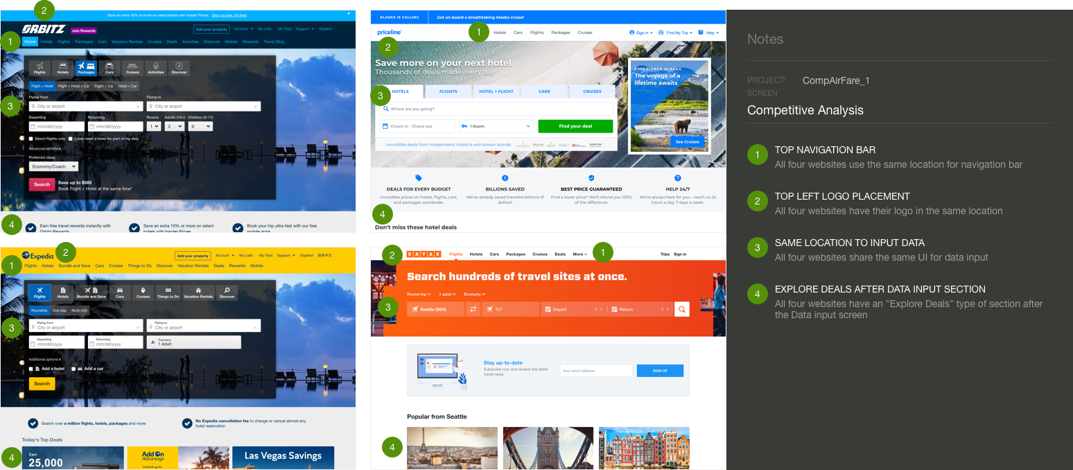 Competitive Analysis Markup in Sketch w/Notebook Pro Plugin
With a better understanding of the major travel resources business model and user interface, I created a discussion guide for user interviews so I could gather a wide range of insight. I made sure that I had relevant data by screening out anyone who have not reserved any travel accommodations within the last six months. I conducted six user interviews but screened three of those six users.
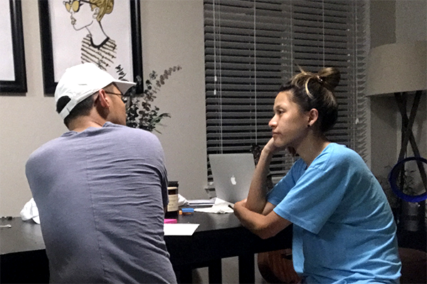 Conducting a User Interview
I discovered that many users do not reserve travel accommodations on their mobile devices because they are not able to compare rates.
“I just don’t see enough information on my phone, you can’t even compare rates on the Expedia App so how do I know I’m getting the best price?”
- Diana P.I began the define phase by creating an affinity map because it’s a simple method to gather insight from my user interviews and identify patterns by using "I" statements.
Those patterns were:
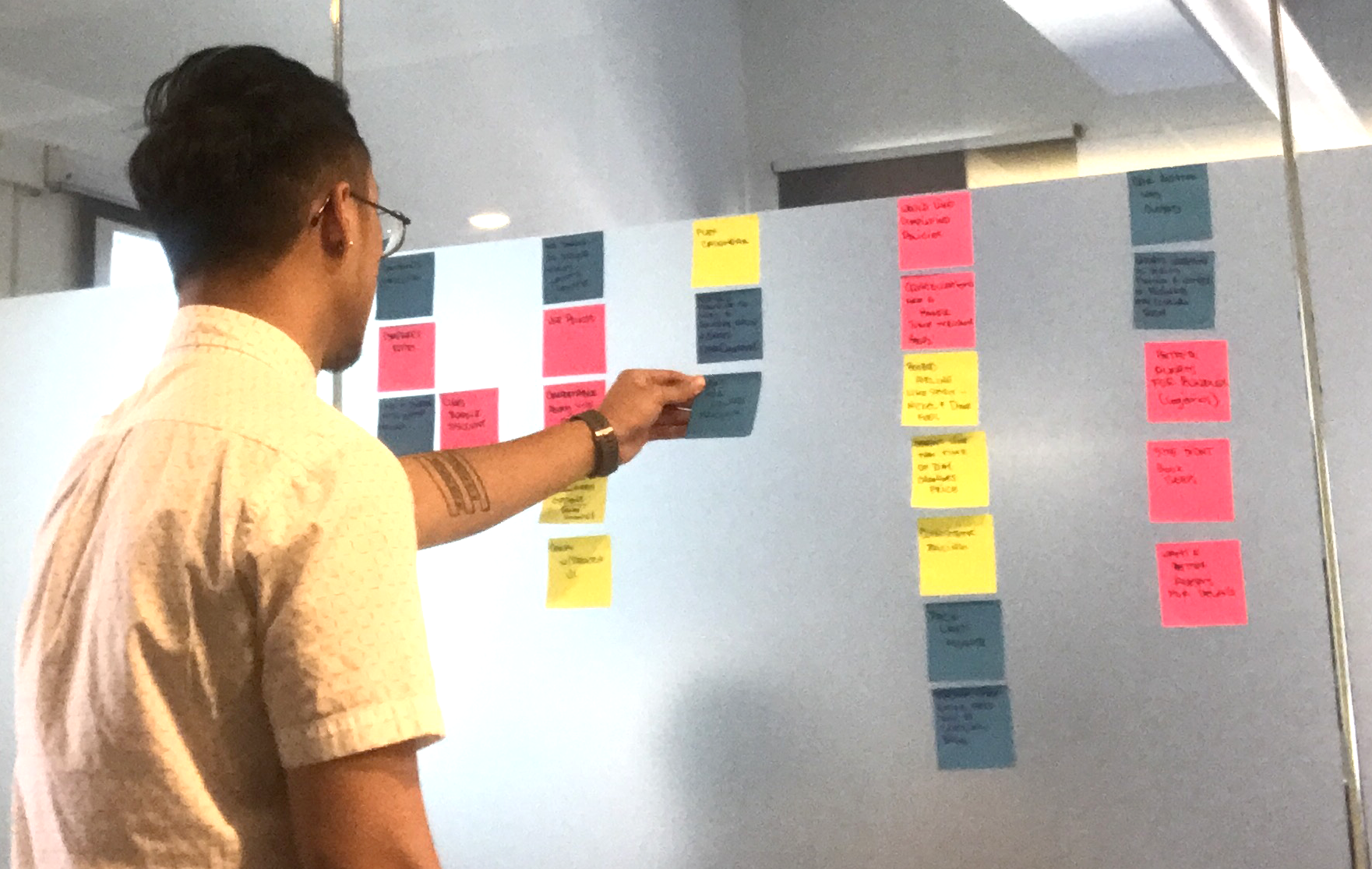 Creating Affinity Map to Identify Patterns
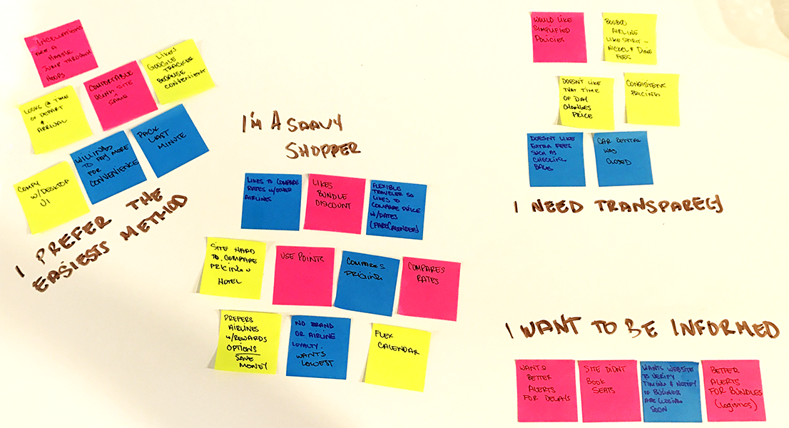 Regrouped Affinity Map to "I Statements" to Identify Patterns Regarding User Behavior
Users are not comfortable booking their travel accommodations through their mobile device because they don't have an easy way to compare rates with other online resources.
I believe by creating an app for users to compare air travel rates between major online resources will improve the users trust, I will know this to be true when users are reserving more air travel accommodations through their mobile device.
My design centered around the least amount of effort for users to compare rates. I began sketching lo-fi wireframes because it’s the most efficient way to begin developing the interaction design in a low commitment manner. Since this was my first time designing an app, I wanted to go with a quick and simple method in case I decide to scrap the the design due to unforeseen discoveries during usability testing.
After two usability tests, I discovered many flaws with my design because I unintentionally focused too much on creating a “do it all” type of app. With all the features, there were many tasks the users were not able to complete. I created a task flow to help me understand what steps needed to complete a task and reiterated my design based on my findings.
Refocusing back on the solution statement, I developed wireframes using sketch to continue usability testing. The task flow helped me realize how many steps it should take for a user to complete their tasks of reserving their travel accommodations.
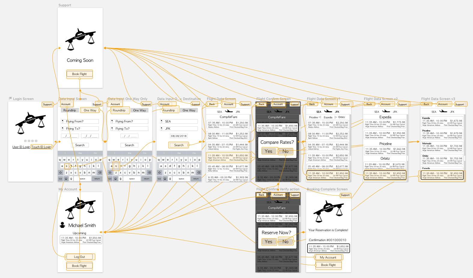 Wireframes + Hotspots for Usability Testing Designed w/Sketch
After an additional usability test, I found that my user did not want to have the option to compare rates, he is using this app as a tool to compare rates so I removed that option to choose in my final iteration.
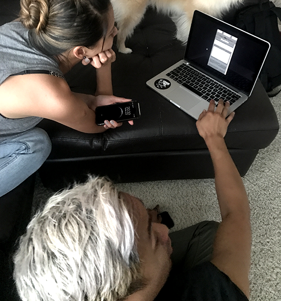 Usability Test 1 and 2
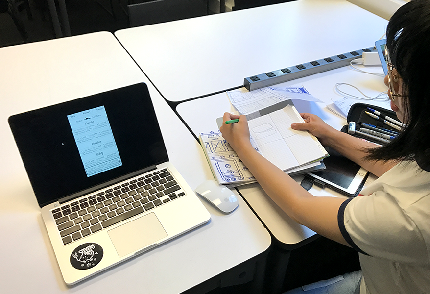 Usability Test 3
With a minimum viable product complete, I used a Sketch Plugin named "Measure" to create redlines for my Hi-Fi comprehensive in case I had a need to pass my wireframes on to a visual designer. Although I ended up designing the Hi-Fi comp, I wanted to learn how to use redlines in a team setting. I designed one Hi-Fi comprehensive while making sure that I adhere to the Human Interface Guidelines. During the usability tests, my users preferred the flight data chunked together and then sorted by the website or company as it is less overwhelming.
I chose a yellow background for my app because during the research, users had mentioned that they were worried they were not getting the best price for their travel accommodations. According to a Color Emotion Guide, yellow provides a feeling of clarity which I believe would help a user not feel overwhelmed when they need to make a decision. Yellow is also considered optimistic and I believe it would give users the sense that they are optimistic about the price they see while using the app. Yellow is also visible to a certain degree by users who are affected by deuteranopia and tritanopia. I decided to go with a white background for the data box and black text to provide the highest level on contrast so users are not straining their eyes while searching for a flight. Placing the selected flight at the bottom allows users to easily compare their flights as they are scrolling and within the thumb zone should users want to move forward with their selection.
The biggest challenge I had were time constraints, I had less then one week to deliver this project and create a deck. Due to the time constraints, I elected to reduce the number of usability tests I had initially wanted to conduct and focused on providing a minimum viable product.
Another challenge I faced was choosing the right methods for the initial research, I had started with a competitive analysis between the websites UI, but after my research I found that user's pain points revolve around a mobile app. In the future, I will conduct the user interviews or a more broad approach before deciding which platform or device to narrow my design on.
If I were to continue developing this app, I would like to conduct more usability tests and address additional pain points with the current design. The time constraints didn’t allow me to test a diverse range of users. After additional testing, I would like to continue more research on additional features to compete with other major online resources such as hotel and car rental.
For a stretch goal, I designed two additional wireframes so users can filter and sort the data according to their preferences.
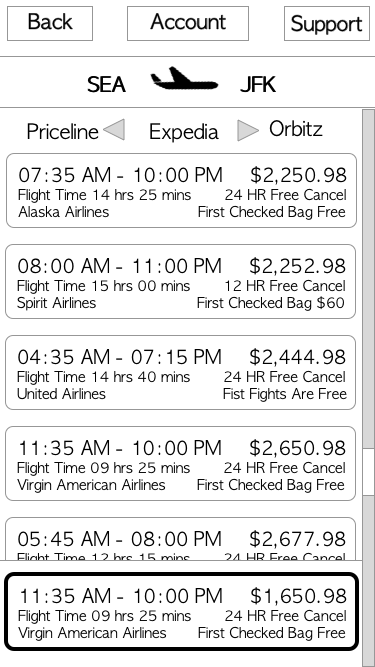 Swipe Left or Right for Other Website
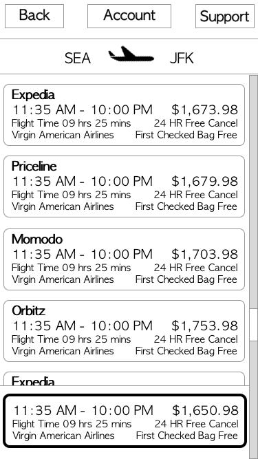 Sorted Starting w/Lowest Price
My biggest take-away from this project was making sure that I designed for the user and keeping an eye on the big picture. There were many instances where I believed my designs were a great idea but during usability tests, my users weren’t able to complete their tasks. If I had tunnel vision on all the features and competing with the other apps then I would have missed my deadline by a long shot. Reminding myself to develop a minimum viable product and provide all my deliverables were the keys to my success with this project.
I'm always interested in hearing ideas and brainstorming!